
What an Award-Winning Health Website Design Teaches Us About Data & Storytelling
Every organization has data, from research findings to survey results. The question is how do you take complex information and turn it into something your audience can use?
That was the primary challenge for Our Health, Our Community (OHOC), a regional health initiative that surveyed over 3,000 Cowichan Valley residents on everything from housing and mental health to food security and transportation.
The resulting data set was one of the most comprehensive regional health snapshots the area had seen with 3,459 analyzed responses across 95 questions.
But comprehensive data and accessible data are two different things. Delivered as a static report or PDF, those findings risked being buried behind a format that residents, community organizations, local governments, or grant writers would struggle to understand or engage with.
That’s where storytelling through interactive web design and web development comes in. Here’s what the project reinforced for us and what it actually takes to make data stick. (Oh and did we mention this won an award too?)
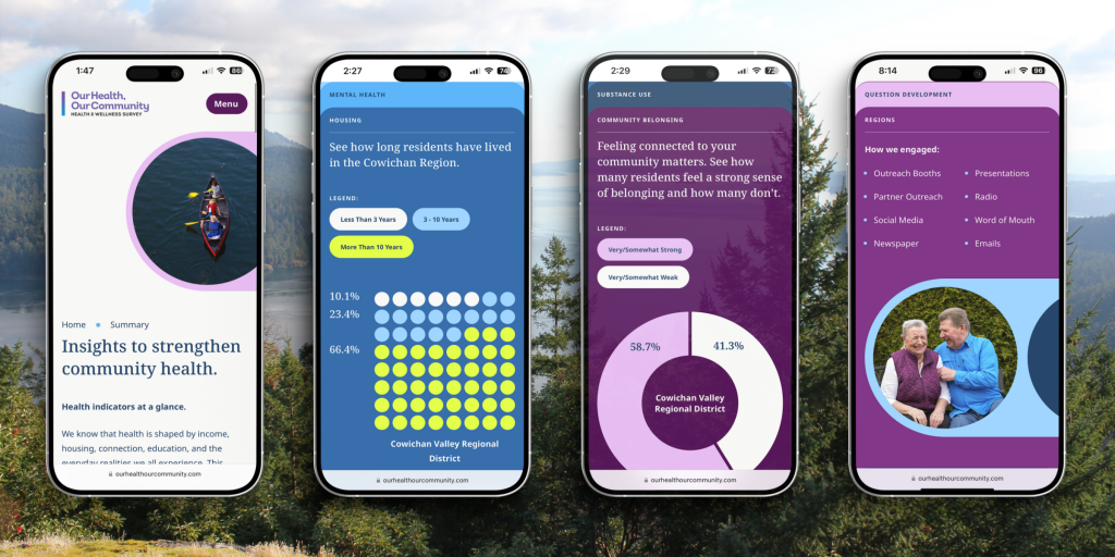
Data needs structure
Think of structure as the outline of your book. A good author knows what points they need to make, in what order, and for whom. Without that foundation, even the most compelling content gets lost.
The same principle applies to data. No matter how significant your findings are, if a visitor lands on your website and can’t immediately orient themselves, they’ll bounce.
One way structure solves this is through content hierarchy. This is the deliberate organization of information around your audience’s needs.
On a data-heavy website like OHOC, that means grouping related findings into logical themes, sequencing information from broad to specific, and making sure every type of visitor has a clear path through the information.
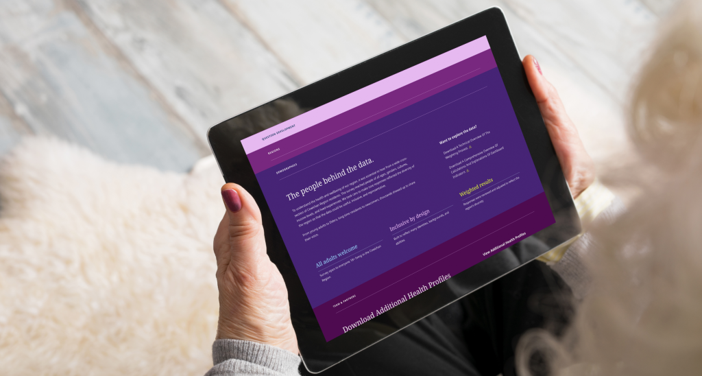
Data needs narrative
If structure is the outline, narrative is the part that transforms a list of plot points into the story a reader finds interesting and engaging. Without strong narrative, a reader has no way of knowing what the data means and how it applies to them.
For OHOC, conversational copy is weaved throughout headlines, content, and call-to-actions. On the survey report itself, questions are turned into meaningful statements that provide context for the reader.
When copy does the interpretive work for the reader, cognitive load drops. People spend less effort figuring out what they’re looking at and more energy retaining the information. That’s the difference between a resource people return to and a report they read once.
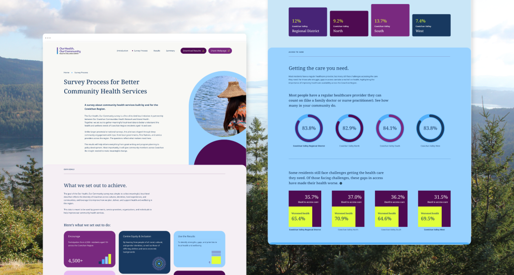
Data needs design
Think of a picture book or a well-typeset novel. It uses illustration to guide readers through the story, or white space and chapter breaks to give the eye somewhere to rest. Design is an important part of how we process and retain information.
On a data website, this is especially true. For OHOC that meant building charts that suit the data rather than forcing findings into generic formats. Layout, colour, and spacing is used to guide the reader’s eye in the same direction the narrative is pointing. Progressive reveals introduce complexity gradually rather than presenting everything at once.
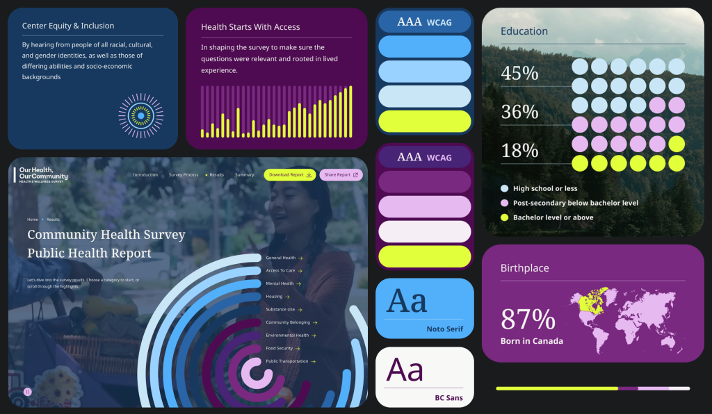
Good data storytelling produces award-winning results
Let’s recap. Structure tells your audience where to go, narrative tells them why it matters, and design makes sure they understand and retain the information. Remove any one of those elements and even the most important data becomes hard to engage with.
That’s the gap good storytelling in data-heavy web designs closes. When those three elements work together, data stops being a deliverable and starts being a resource.
The proof? This project won platinum at the 2026 Hermes Creative Awards in the Website, Medical/Healthcare category. But the bigger win is how useful this website has been for the Cowichan community. Here’s what Cara McLean from Island Health had to say:
If you’re curious to read the full scope of the project, be sure to check out our portfolio below.