Building a residential identity rooted in Nanaimo’s waterfront character.
Nanaimo, BC
Saltwind is an upcoming rental development located along Nanaimo’s Terminal Avenue corridor, where the city’s working harbour, coastal setting, and evolving urban landscape come together. Envisioned as more than a standard rental building, it needed a brand identity that reflected its waterfront surroundings, supported long-term resident appeal, and felt calm, refined, and considered from the first touchpoint.
With a focus on livability, durability, and lasting value, Saltwind required a visual identity that could capture both the character of its location and the quality of the homes being created. Our team was brought in to develop a brand system that felt specific to Nanaimo’s waterfront while giving the development a polished, memorable presence across signage, marketing materials, and digital applications.
-
Brand Collateral
-
Brand Standards
-
Collateral
-
Copy Review & Editing
-
Logo Design
-
Signage
-
Visual Identity System
-
Website Design & Programming


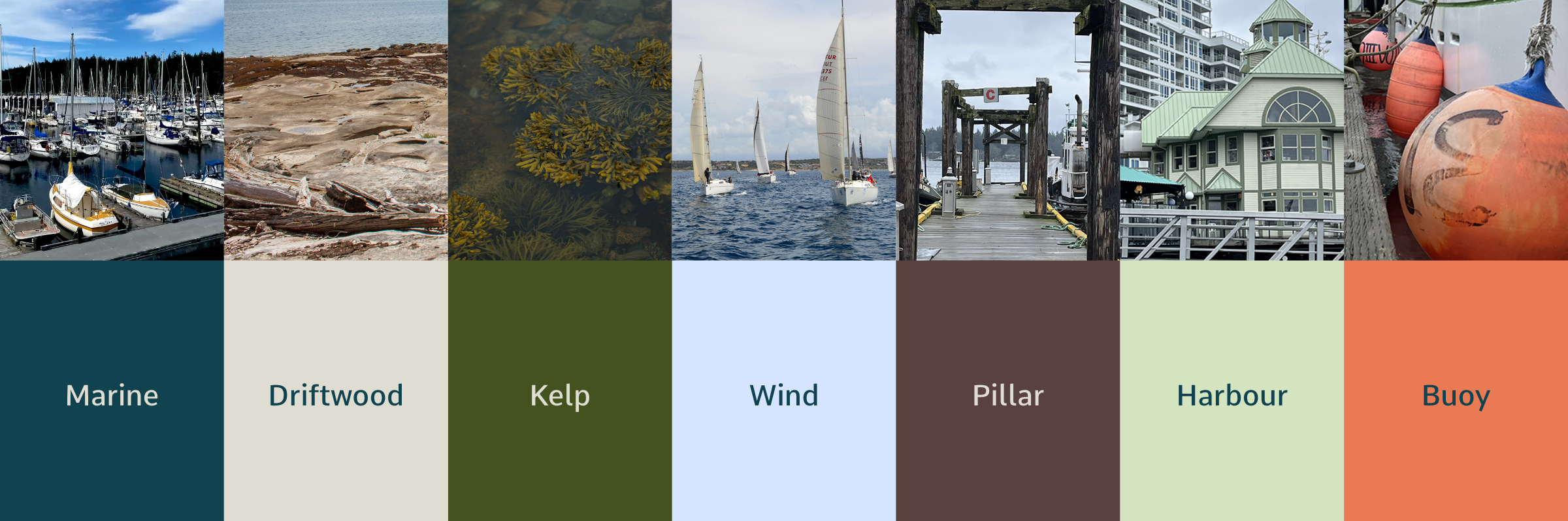
- Saltwind’s colour palette was developed to feel directly connected to its location. Drawing from Nanaimo’s waterfront setting and the natural greenery of Vancouver Island, our designers created a palette that feels calm and tied to place. Earthy tones bring warmth and depth, inspired by the surrounding landscapes and parks, while cooler blues reflect the ocean and marine air. Deep greens draw from the island’s greenery and kelp forests, grounding the palette in its natural environment, while softer neutrals echo driftwood and the lightness of the waterfront. Accents of brown reference the marina’s structural elements, and a touch of vibrant orange adds clarity and contrast inspired by functional harbour markers. Together, the colours give Saltwind a visual identity that feels welcoming and rooted in its natural setting.
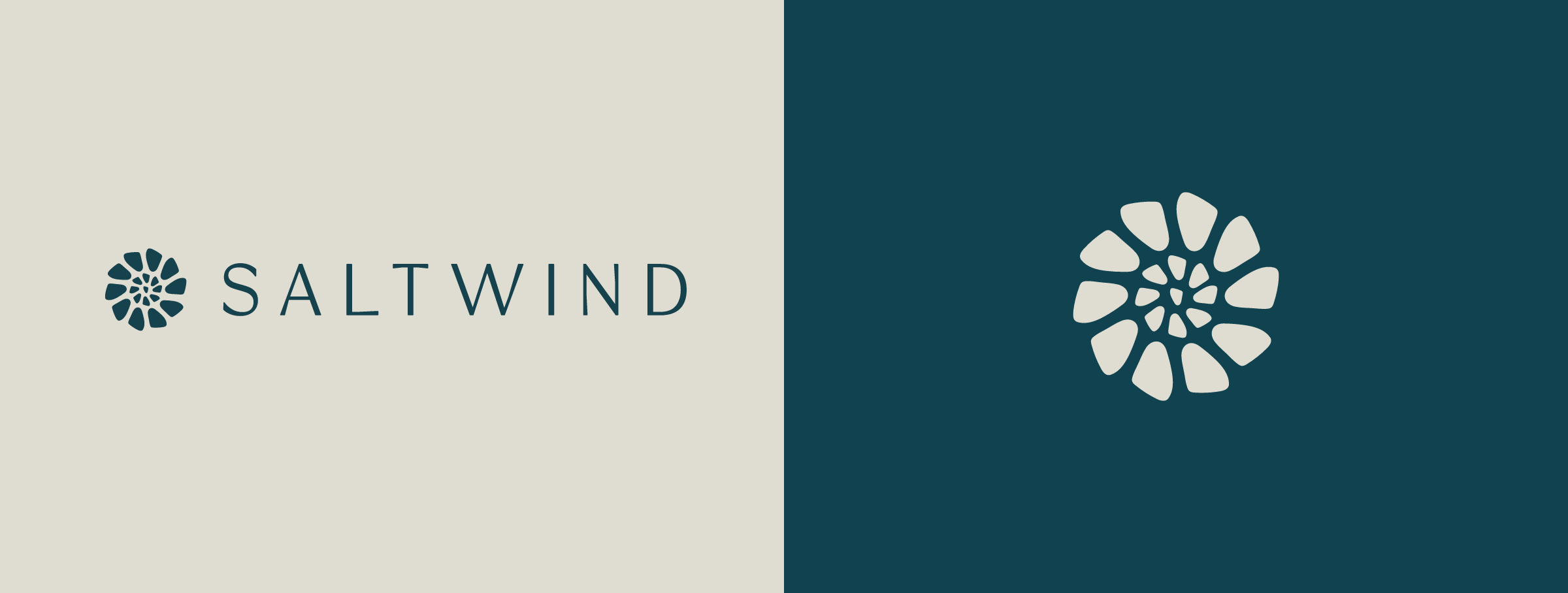
- The Saltwind logo was inspired by the internal structure of shells and shell fossils, where smaller compartments come together to create a larger, unified form. In the icon, those shapes are influenced by the triangular geometry of the development site itself. Each form can be read as an individual unit, life, or family, while the full mark spirals outward from a shared centre, referencing both natural shell growth and the idea of community. The result is a symbol that feels coastal, architectural, and connected, reflecting Saltwind not just as a building, but as a community shaped by the people who live there.
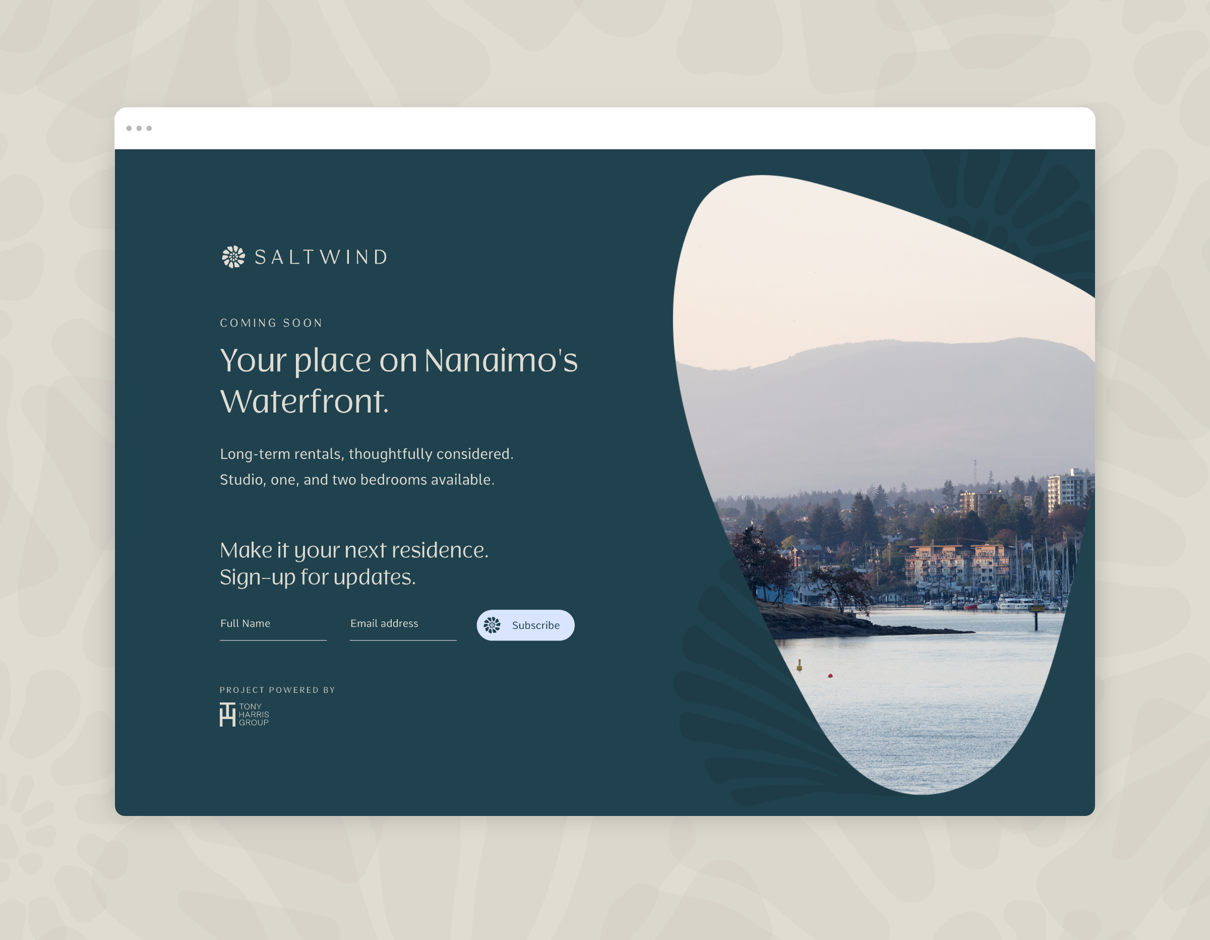
- To support early interest in the development, our team designed and developed a splash page for Saltwind. The site introduces the brand and gives prospective residents a clear place to sign up for project updates before the full leasing experience is launched, helping build early awareness while creating a polished digital presence for marketing, leasing inquiries, and future campaign traffic.
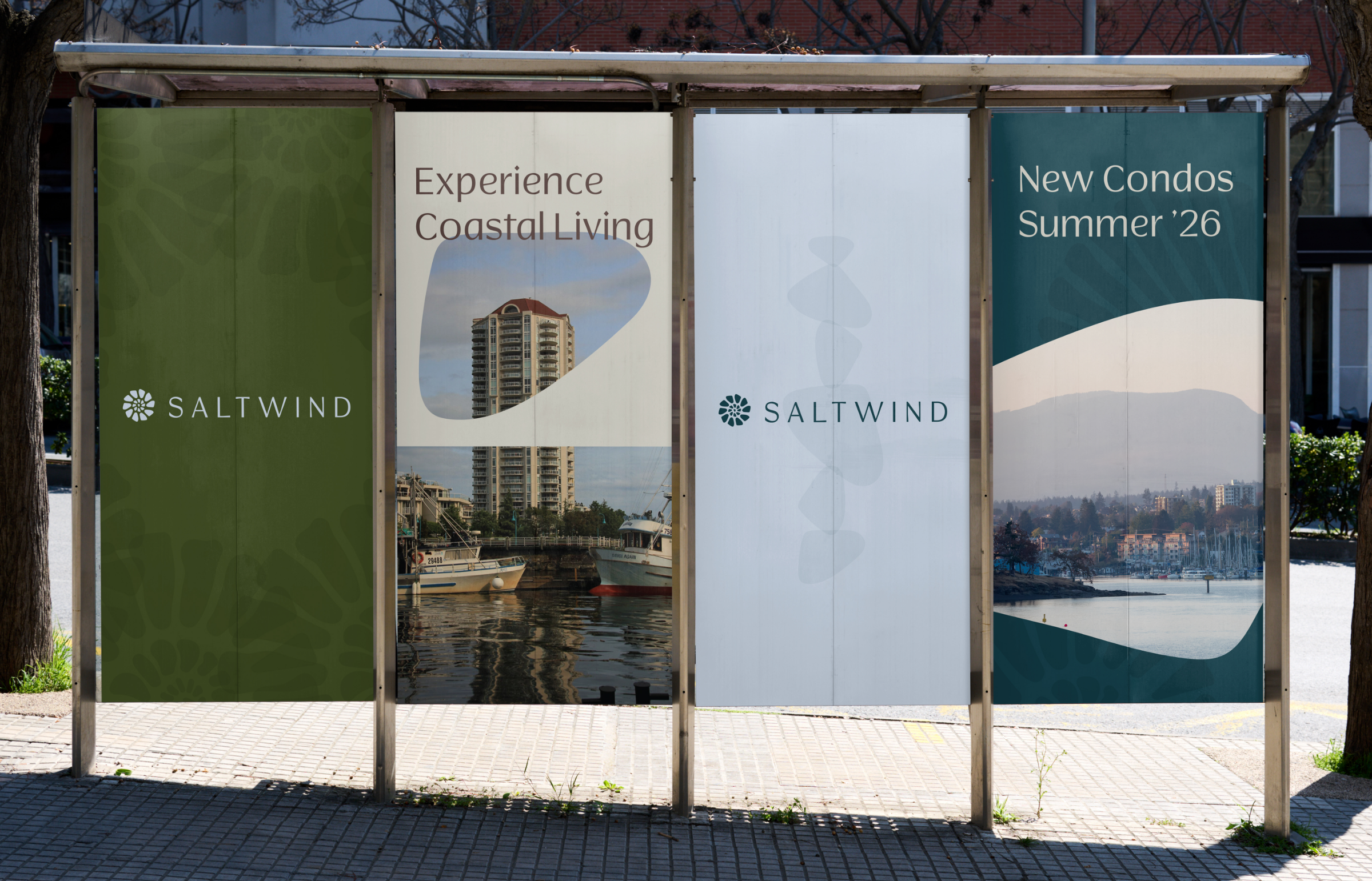
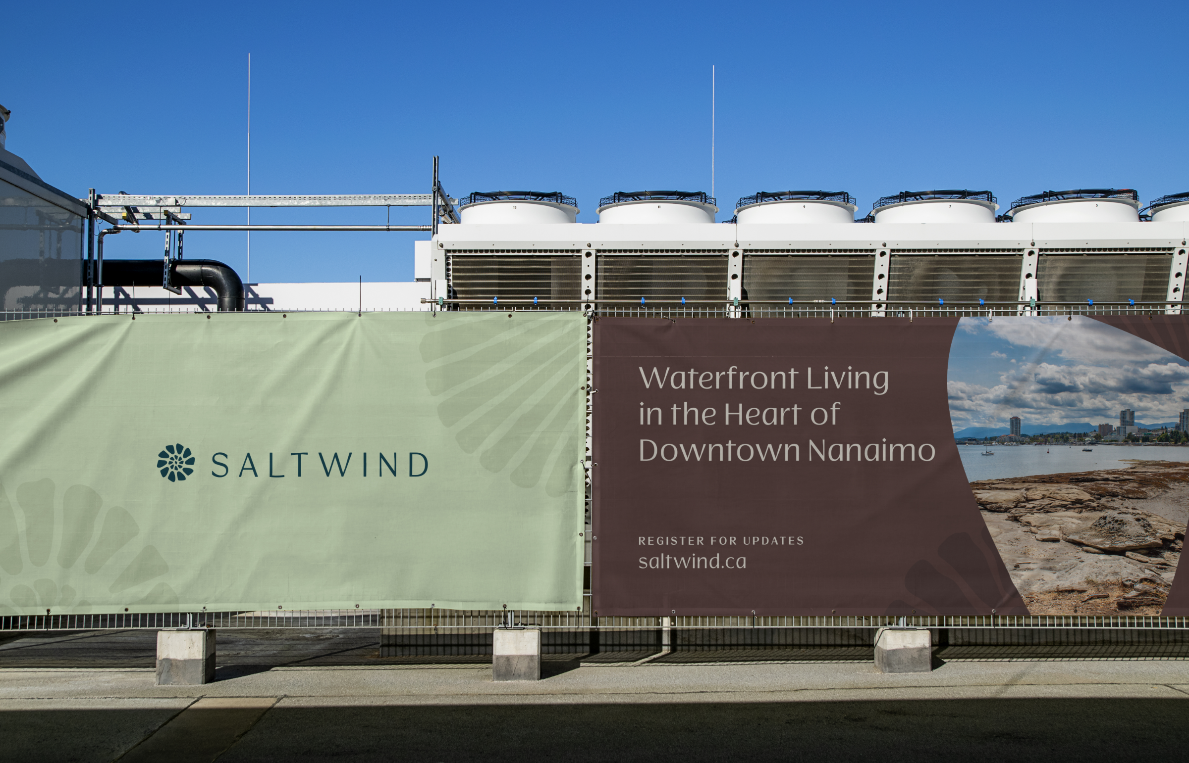
- Our team also developed exterior signage to give Saltwind an early street-level presence before leasing formally begins. Using the project’s visual identity, waterfront-inspired colour palette, and custom brand elements, the signage creates a polished first impression while helping connect onsite visibility with early digital interest.
- To extend the identity beyond traditional signage, our team also worked with the project architects on an exterior feature wall for the building façade. The selected direction builds on the Saltwind logo by scaling the shell-inspired icon into a larger architectural element.
- The design uses the Saltwind logo and wordmark at the top, with a cropped two-tone version of the icon expanding across the façade below. Raised cutout panels introduce depth through light and shadow, echoing the layered natural forms that inspired the original mark. As daylight shifts across the building, the feature creates subtle movement while reinforcing the idea of individual forms coming together as one larger whole, creating a memorable brand moment that remains connected to the architecture.
- The design uses the Saltwind logo and wordmark at the top, with a cropped two-tone version of the icon expanding across the façade below. Raised cutout panels introduce depth through light and shadow, echoing the layered natural forms that inspired the original mark. As daylight shifts across the building, the feature creates subtle movement while reinforcing the idea of individual forms coming together as one larger whole, creating a memorable brand moment that remains connected to the architecture.