
Coastal Accents Millwork
A custom millwork brand identity design where every piece comes together.
Location
Victoria, BC
Coastal Accents Millwork is a custom cabinetry and millwork company serving homeowners, interior designers, contractors, and builders in Oak Bay and Victoria. Backed by more than 45 years of construction experience through sister company MAC Reno, the team designs and installs custom cabinetry and millwork for kitchens, bathrooms, built-ins, outdoor spaces, and closets.
With a new Estevan Village showroom in the works, Coastal Accents needed a brand of its own before the doors opened. Array partnered with the team to develop everything from the strategy behind the brand to the logo, visual identity, teaser window graphics, brand execution concepts, and a custom website designed to introduce Coastal Accents to the Victoria market.
What did we do?
-
Brand Collateral
-
Brand Messaging and Tone
-
Brand Standards
-
Branded Business Cards and Letterhead
-
Custom Illustration & Iconography
-
Environmental Design
-
Logo Design
-
Responsive Website Graphic Design
-
Visual Identity System


How Did We Help Them Out?
- We kicked things off with a Brand Messaging Strategy to understand who Coastal Accents needed to reach and what mattered most to them. From that work, we developed Coastal Accents’ brand promise, mission, vision, positioning, key messages, values, narrative voice, and tone.
- Our design team translated the strategy into a visual direction we called “Japandi Meets Joinery.” Inspired by the calm, refined qualities of Japandi interiors, the identity pairs a considered design aesthetic with visual references that come directly from cabinetry and millwork.
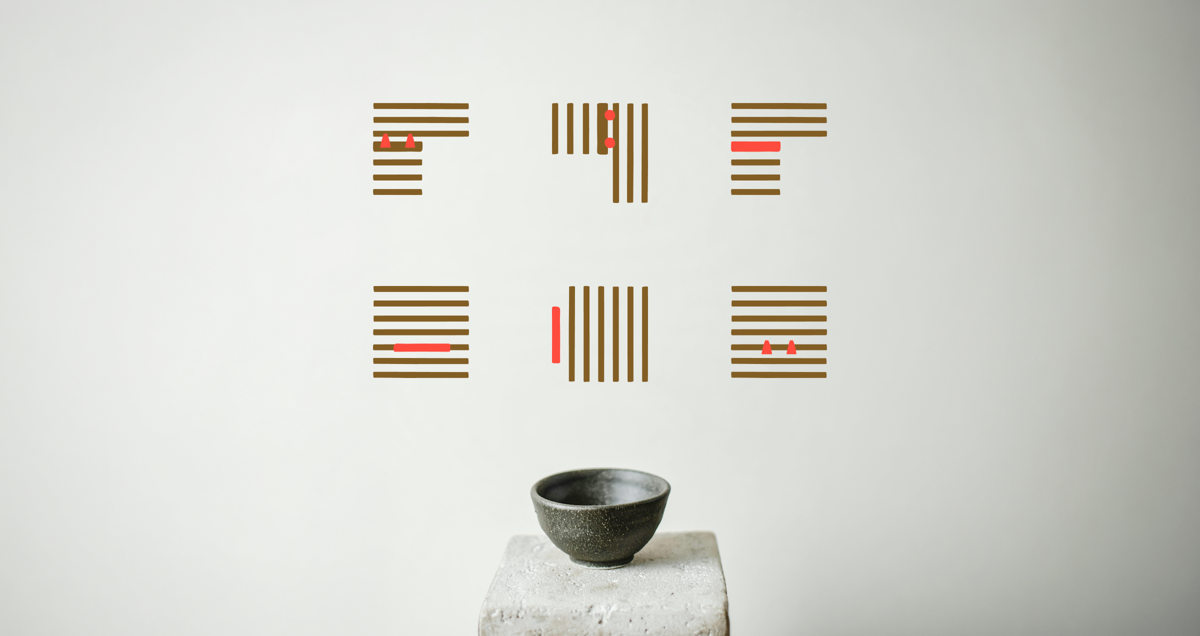
- We created custom graphic elements inspired by slatted wood textures and classic mortise, dovetail, dowel, and bridle joints. The illustrations highlight separate pieces coming together, creating a visual nod to both traditional joinery and the collaboration between the Coastal Accents team and its clients, designers, and builders.
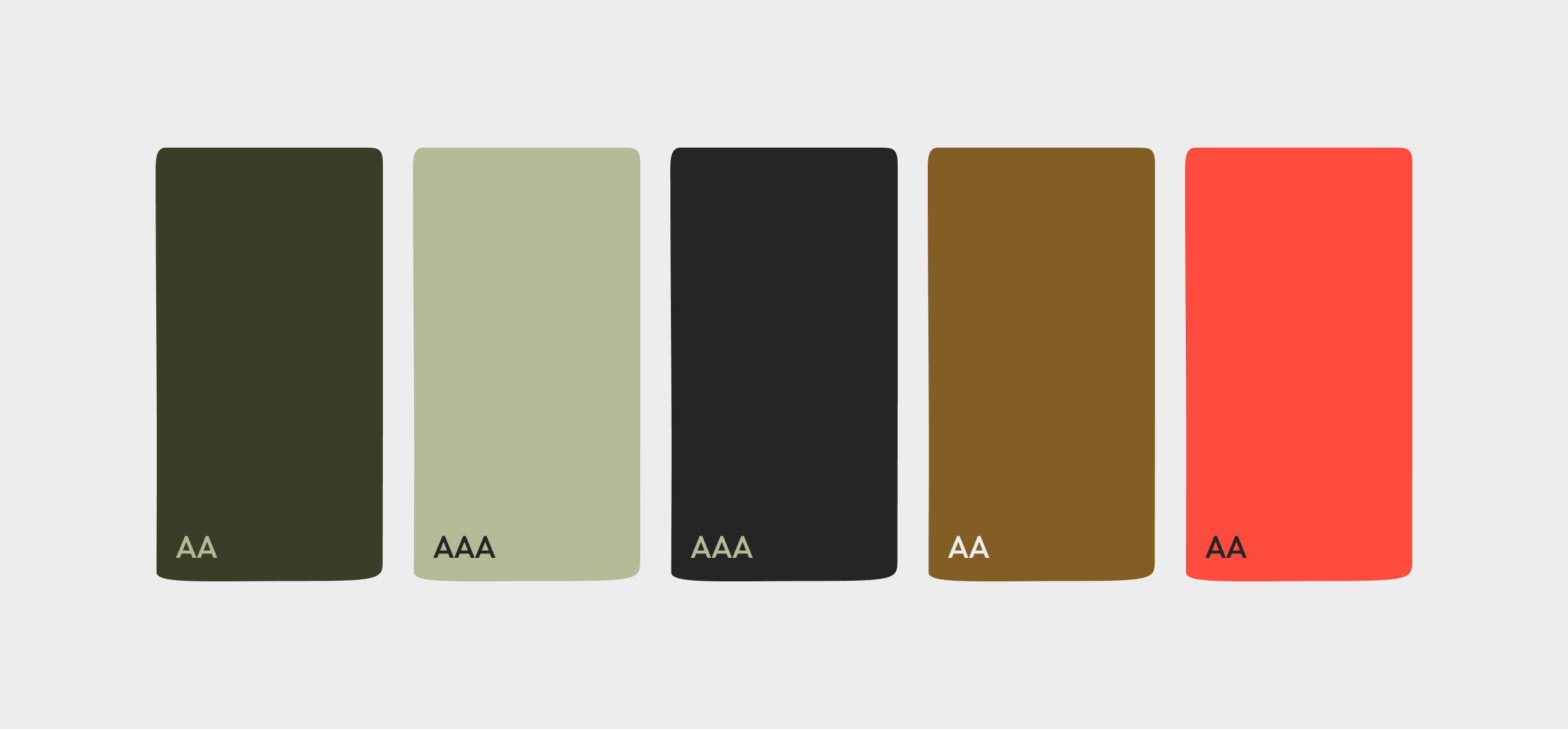
- The colour palette combines dark neutrals, natural greens, warm wood tones, and a brighter accent using Ebony, Birch, Japanese Maple, Evergreen, Cedar, and Sage. Together, the colours support the brand’s warm, grounded character while giving the visual identity enough range to work across print, digital, signage, and the showroom.
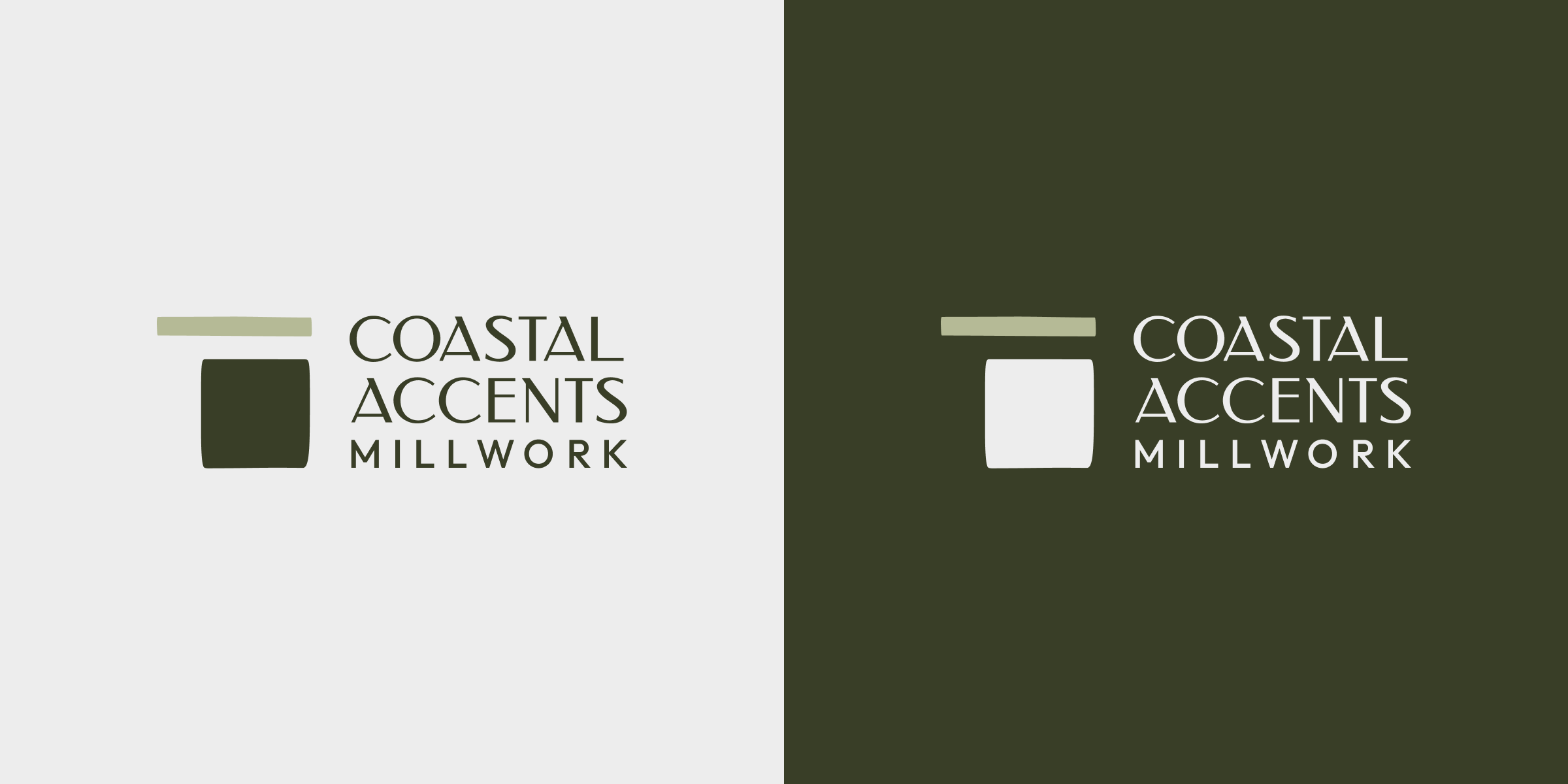
- For the logo, the icon is inspired by the side view of a cabinet box and countertop while also representing two intersecting pieces coming together. The Coastal Accents wordmark is paired with “Millwork” in Outfit, carrying a subtle typographic connection to MAC Reno while giving the new company a distinct identity of its own.
- We documented the new identity in a complete set of Brand Standards covering logo usage, colour, typography, graphic elements, colour accessibility, and photography, giving the Coastal Accents team a clear reference for keeping the brand consistent across future applications.
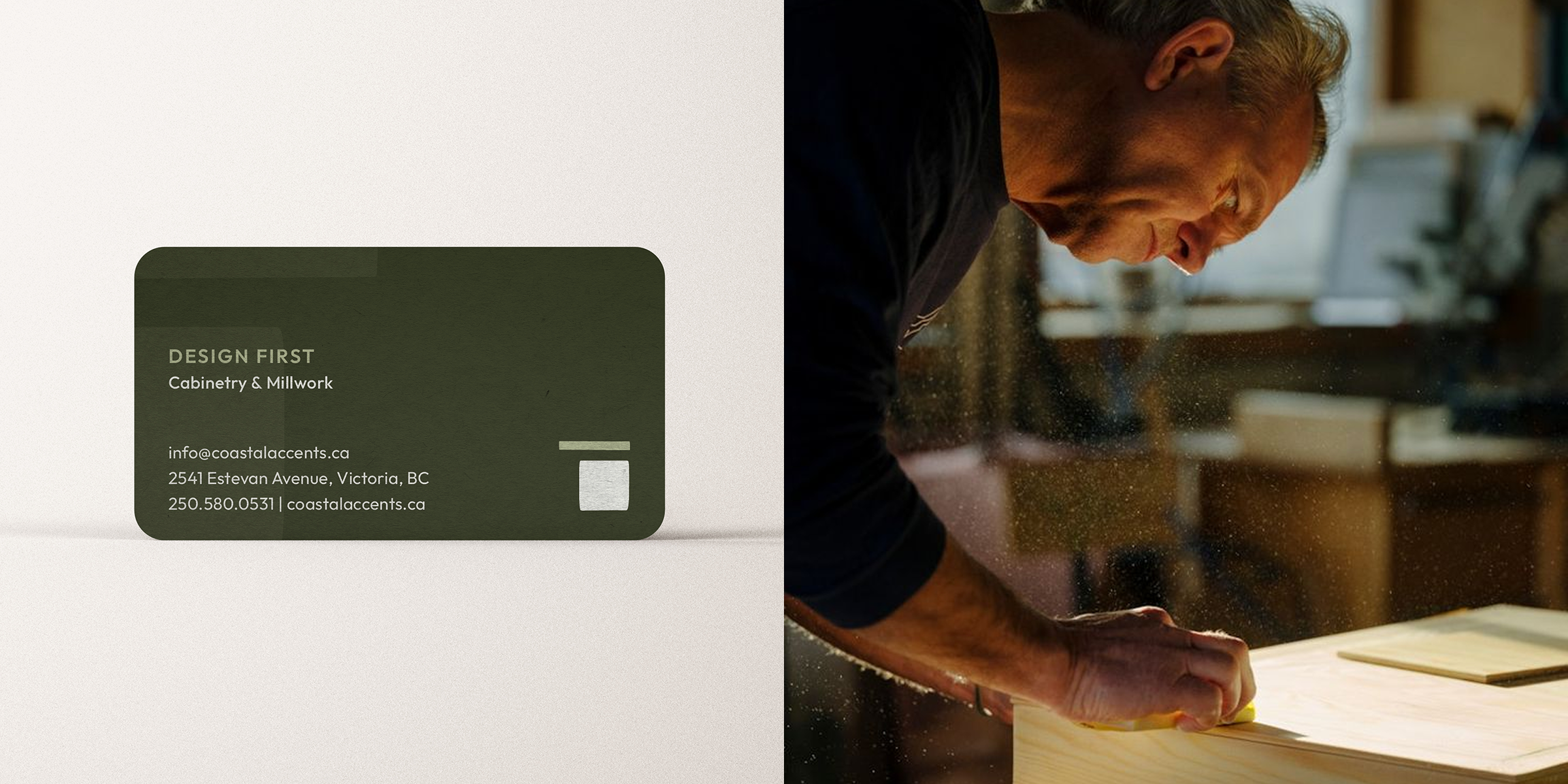
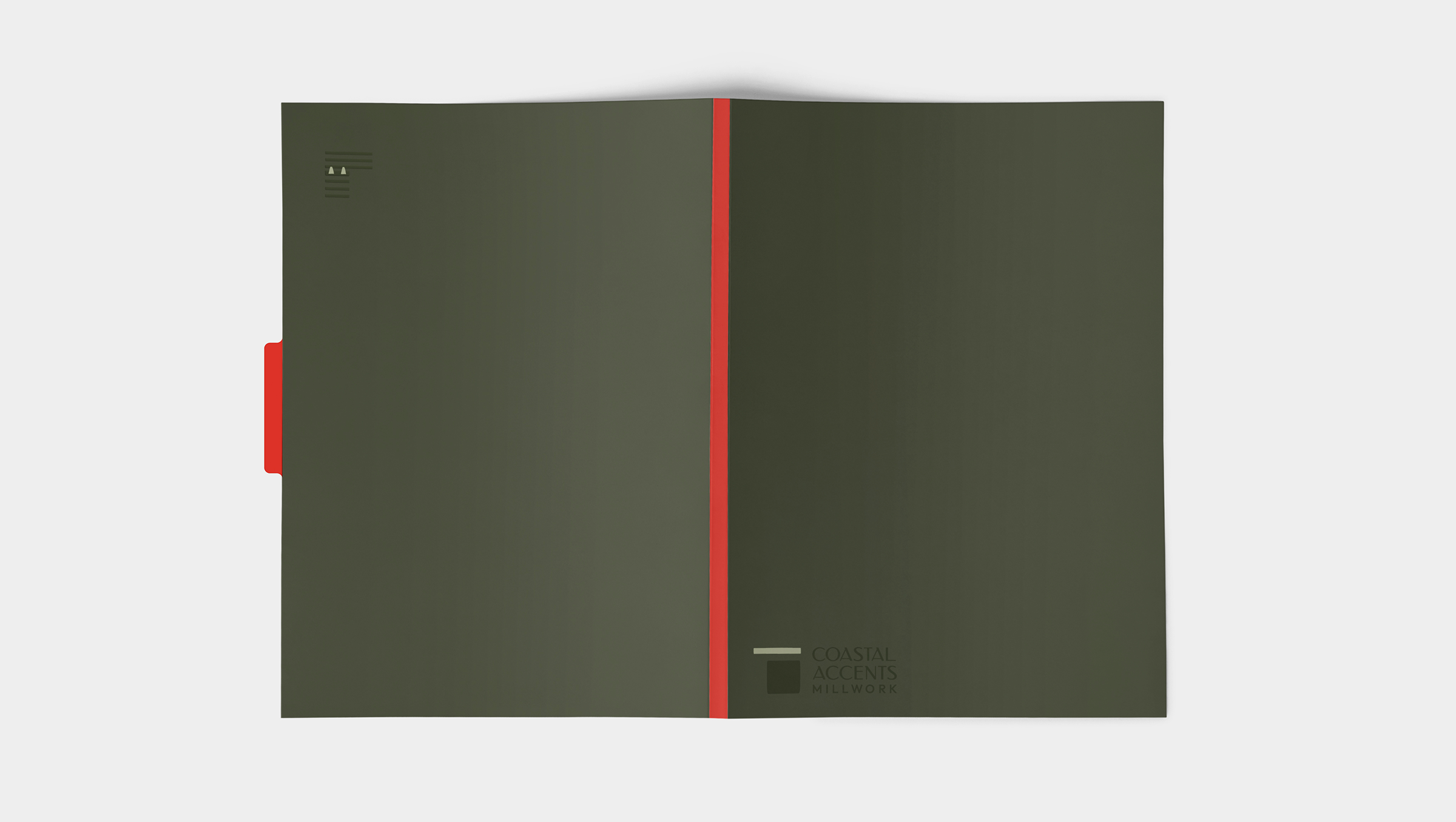
- We also carried the identity into a stationery suite including business cards, letterhead, and presentation folders, giving the team a polished set of everyday materials that extend the new brand into day-to-day use.
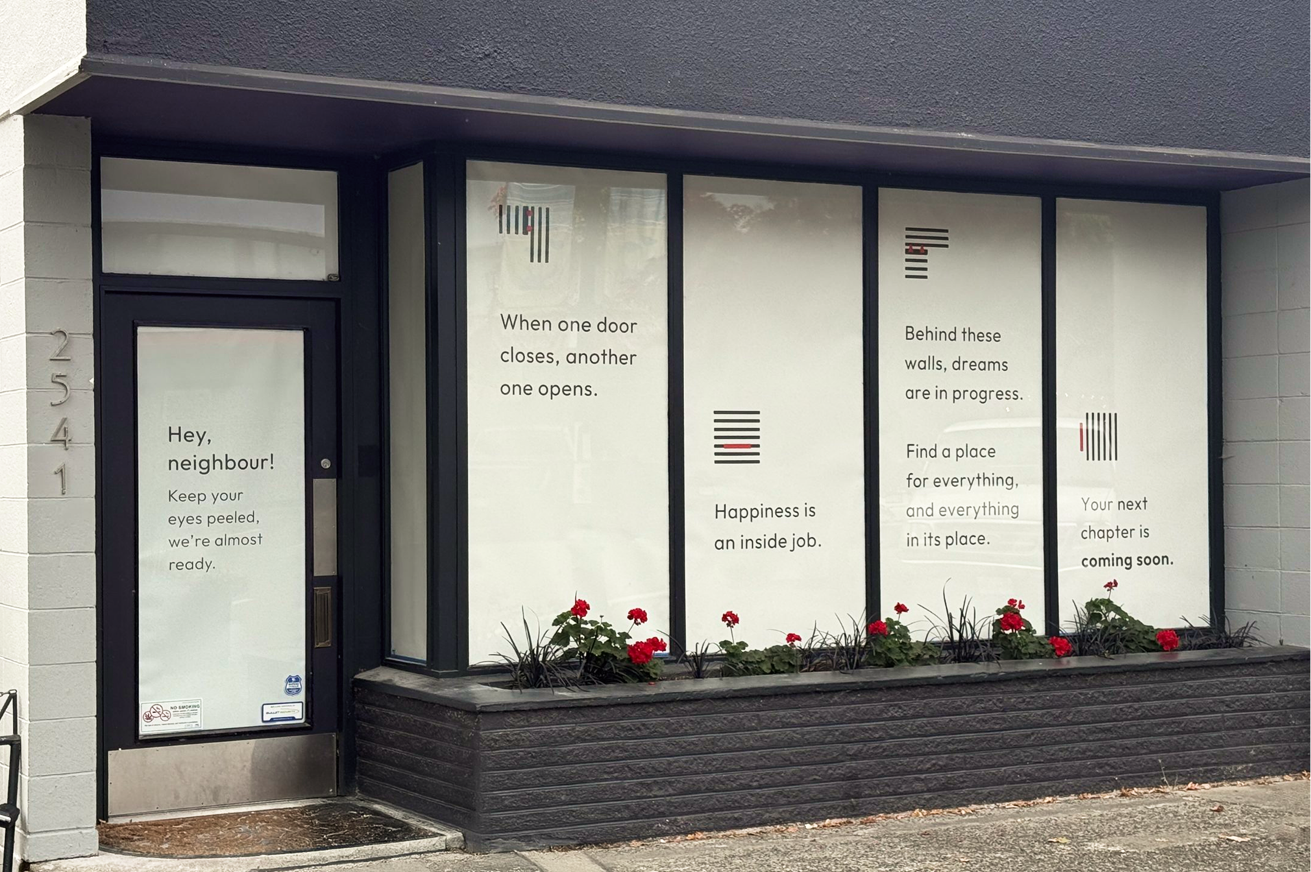
- Before the showroom was ready to open, we put the construction-covered windows to work. Our teaser graphics introduced pieces of the new identity alongside messages like “When one door closes, another one opens,” “Happiness is an inside job,” and “Behind these walls, dreams are in progress.” The graphics gave neighbours a preview of Coastal Accents’ personality while keeping what was happening inside just mysterious enough to build some curiosity.
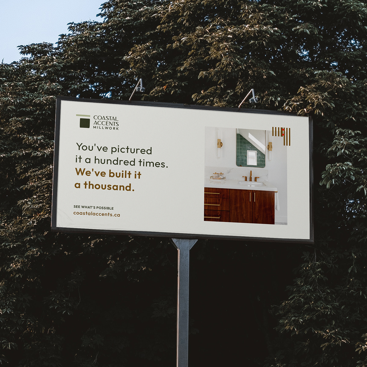
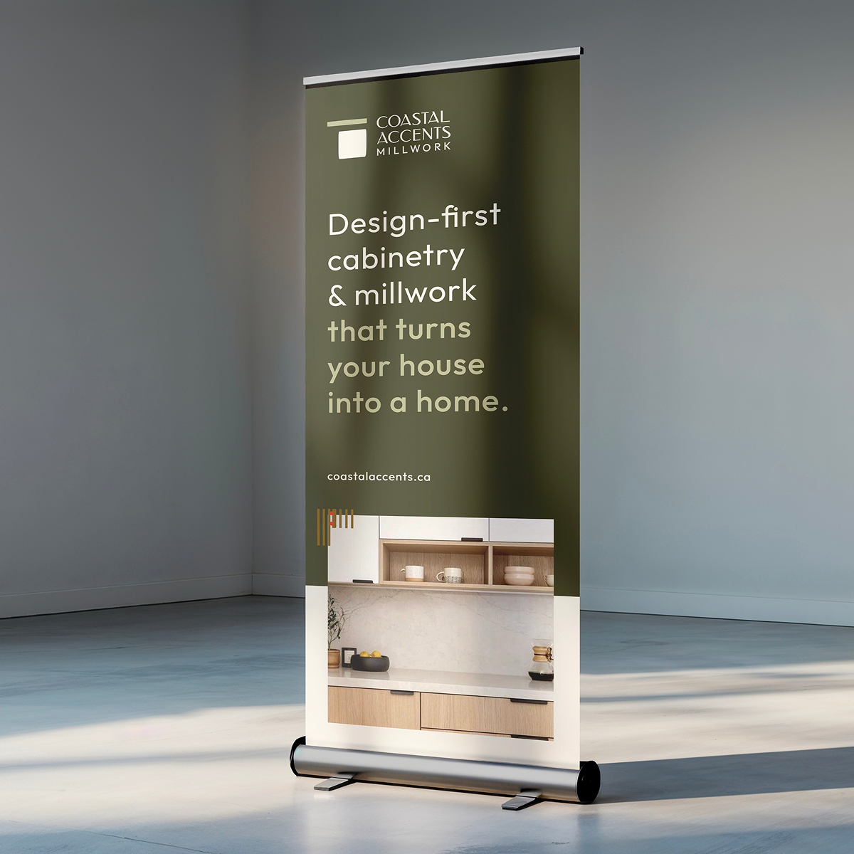
- Once the identity was established, our designers created a Brand Execution Inspiration Deck to show how Coastal Accents could continue to bring the brand to life. Concepts explored applications from signage and trucks to apparel, billboards, and pop-up banners, giving the team a practical reference for applying the identity as the brand grows.
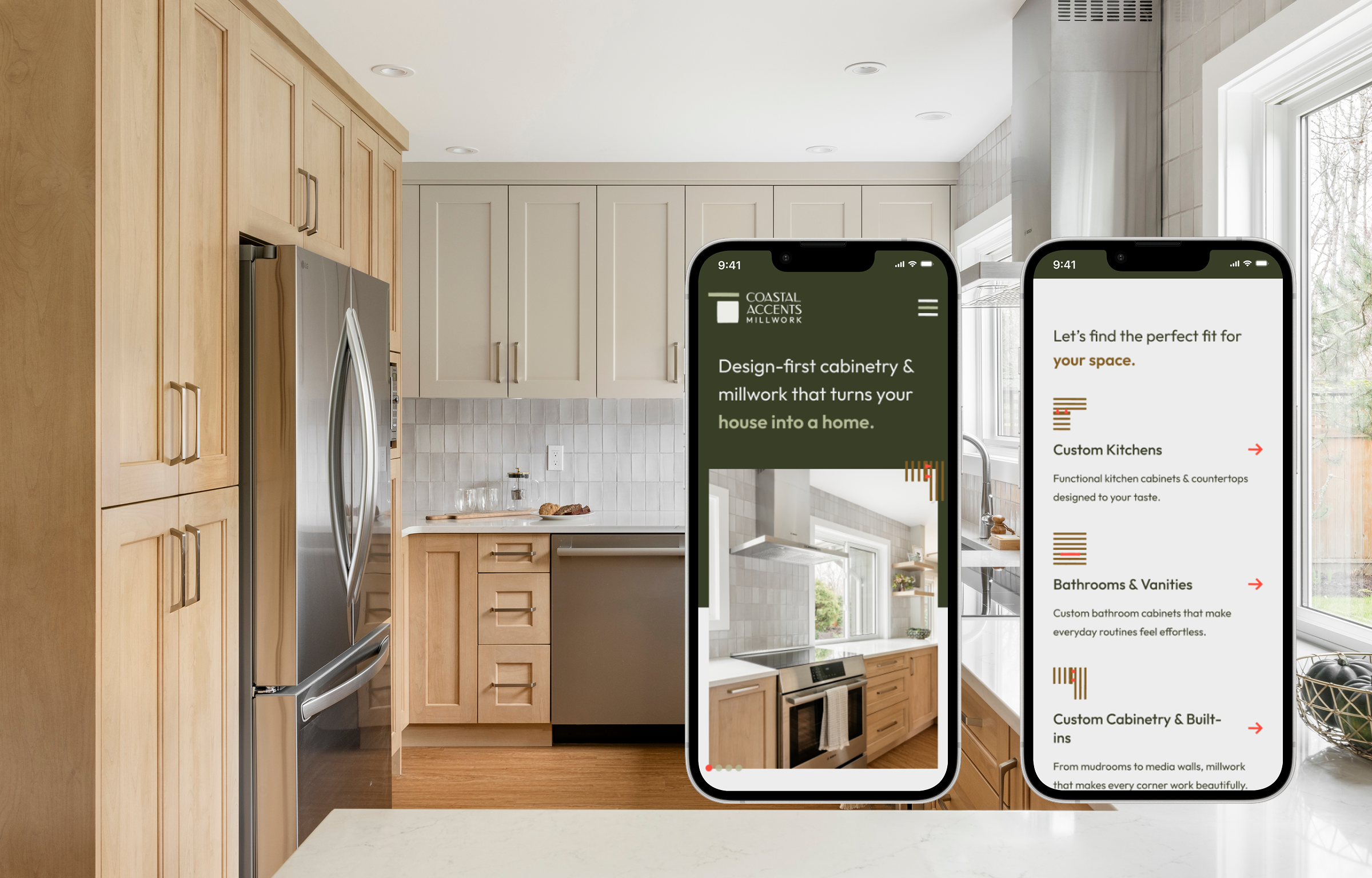
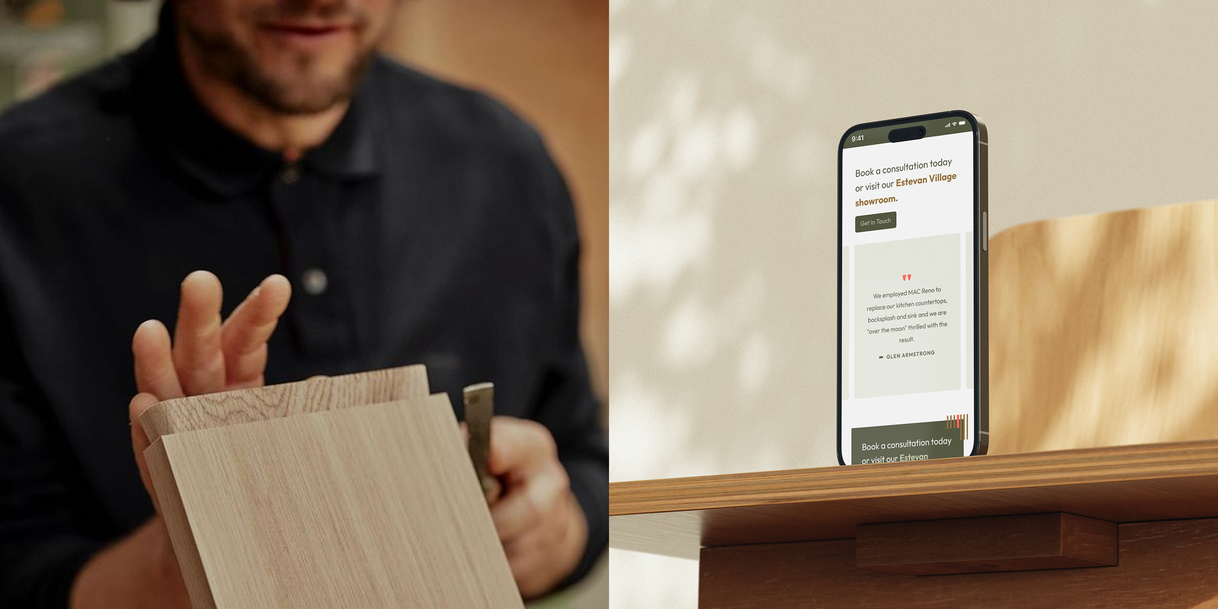
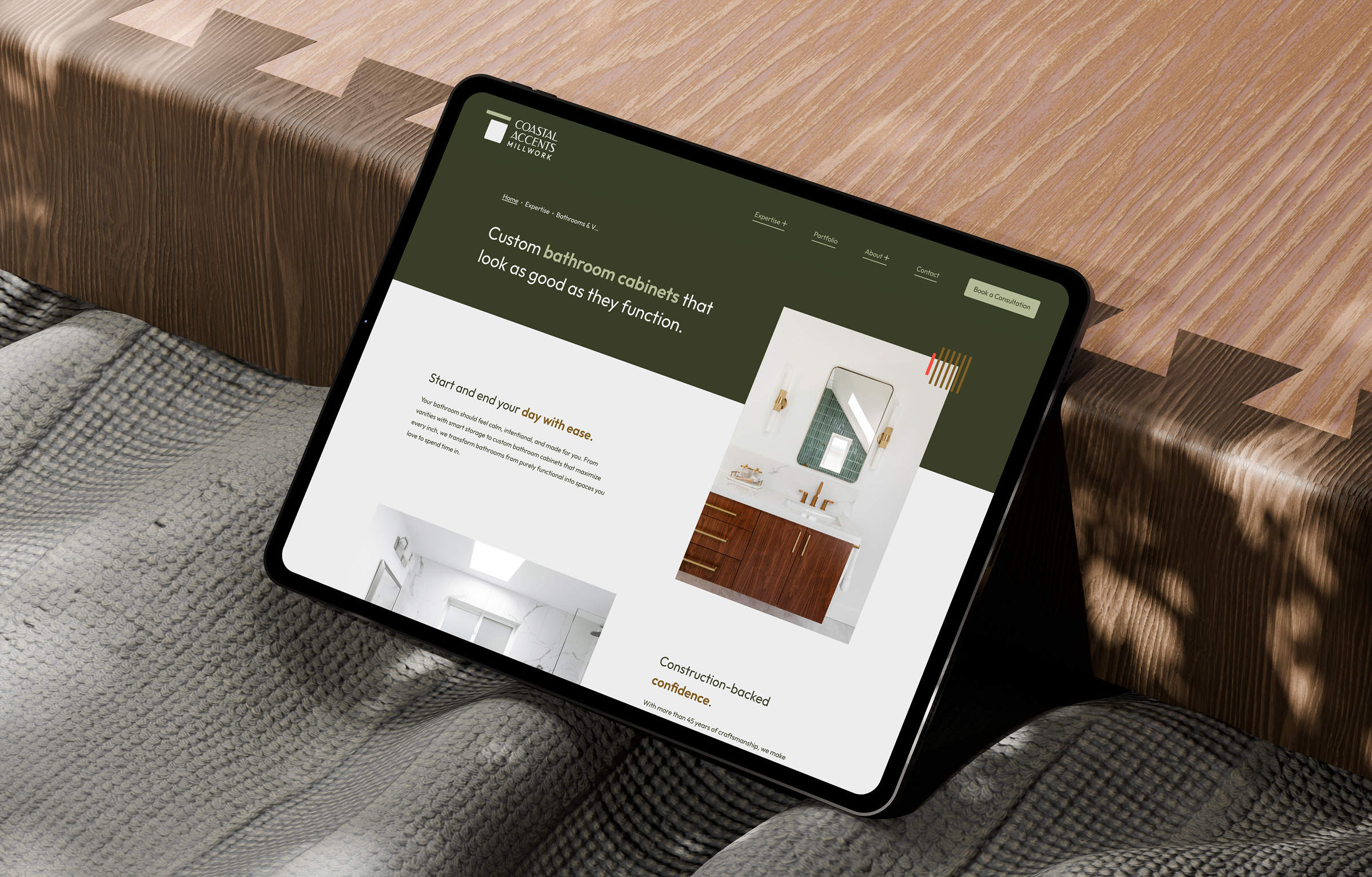
- Our web team then carried the new identity into a custom website. The joinery-inspired graphic elements, restrained colour palette, typography, and project photography carry through the website experience, while dedicated content helps visitors understand both what Coastal Accents creates and how the team works.

Great brands don’t stand still. So—what’s next for yours?
We’d love to help you evolve with purpose.