
Location
Gabriola Island, BC
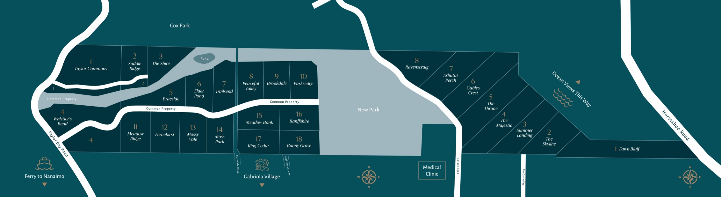
Sitka Estates is a luxurious collection of stunning waterfront acreages and building lots set within a secluded, serene woodland on Gabriola Island. The Array team was selected to create a traditional brand identity for the second phase of this development to portray the carefree coastal lifestyle this unique development offers, along with a range of marketing touchpoints that would make a stunning first impression on prospective homebuyers, including a logo design, custom web design, print materials and signage.
What did we do?
-
Copywriting Strategy & Planning
-
Logo Design
-
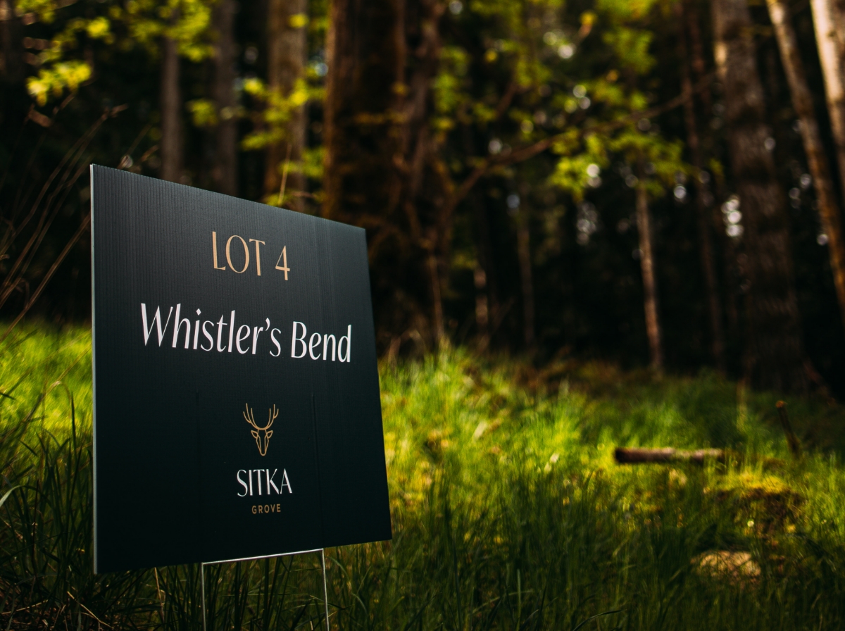
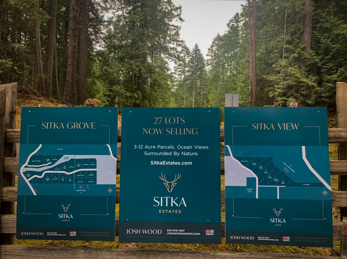
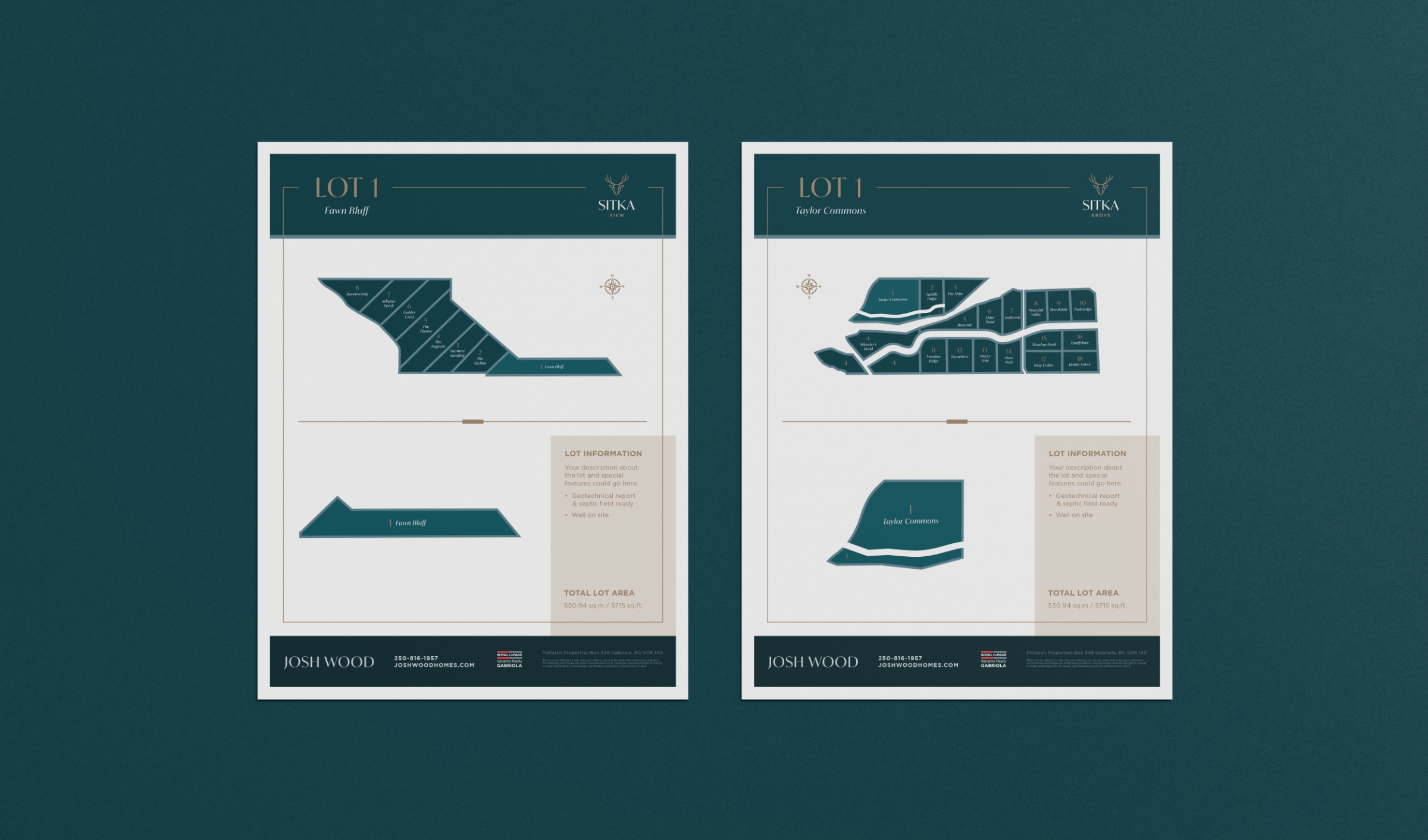
Signage
-
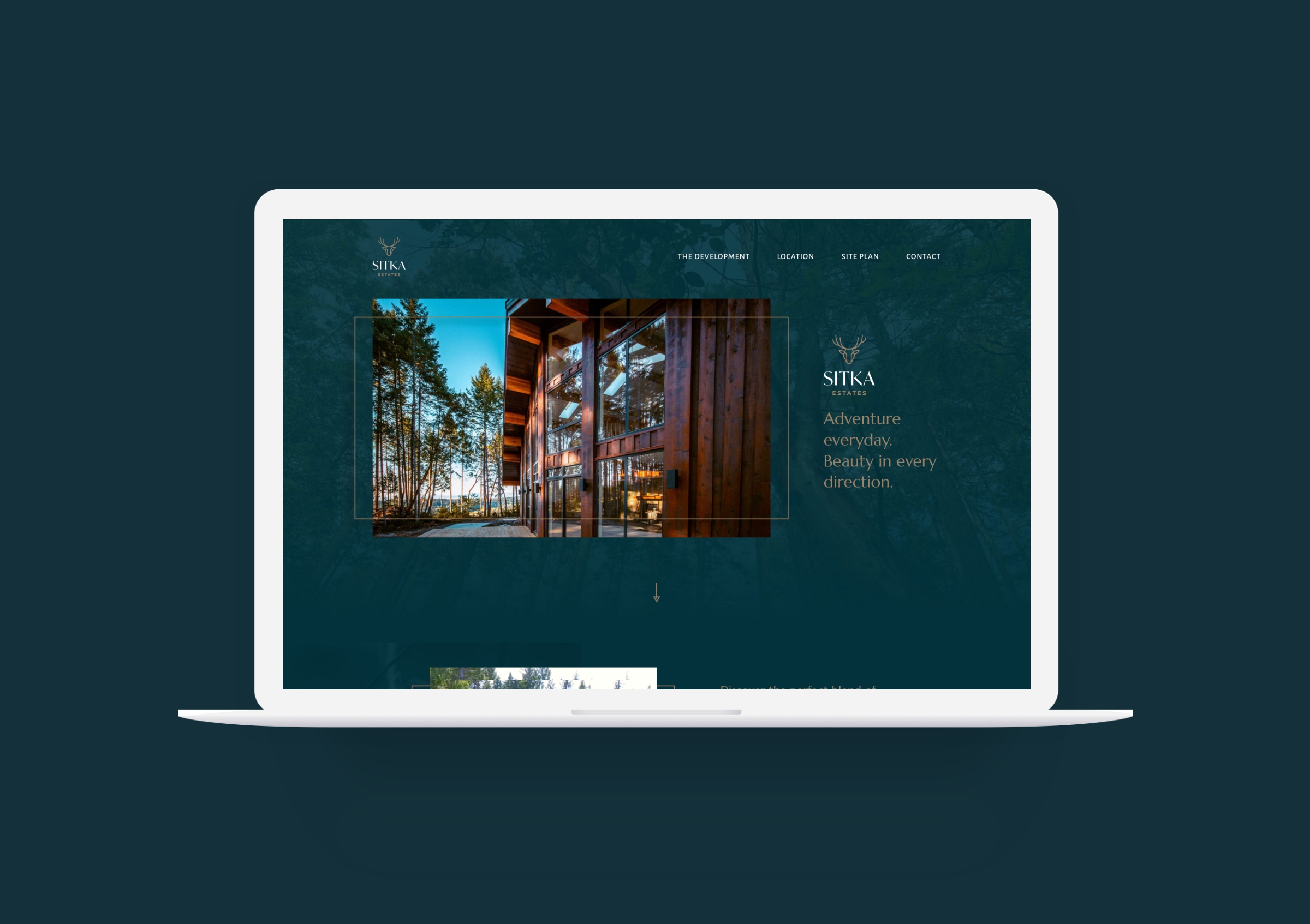
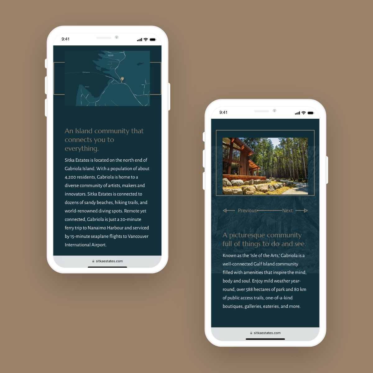
Website Design & Programming


Awards

How Did We Help Them Out?
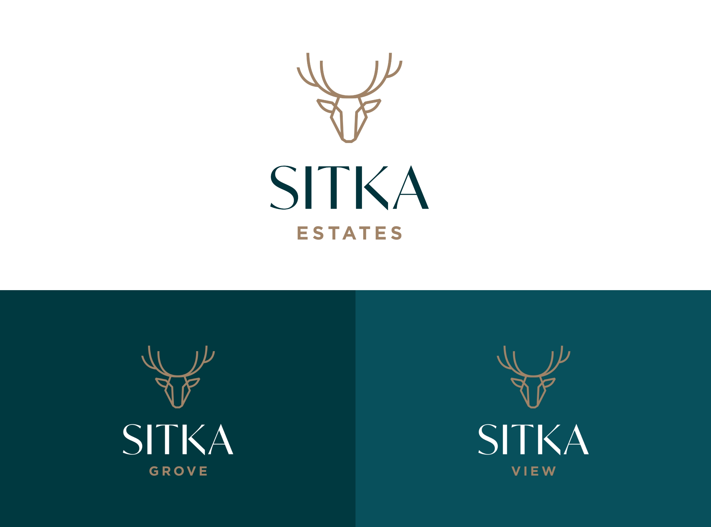
- Building off the success of the first phase, we created a complimentary logo design with a modern, geometric-style logo built upon their existing deer-head emblem. The minimal angular lines of the icon are designed to convey feelings of elegance and reflect the refined, luxurious lifestyle the development offers. The logotype was selected for its blend of thick and thin strokes that play beautifully together, creating a well-balanced, eye-catching design that demands attention.
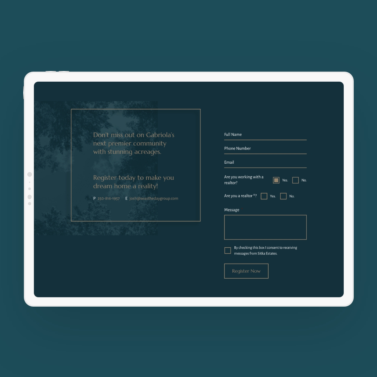
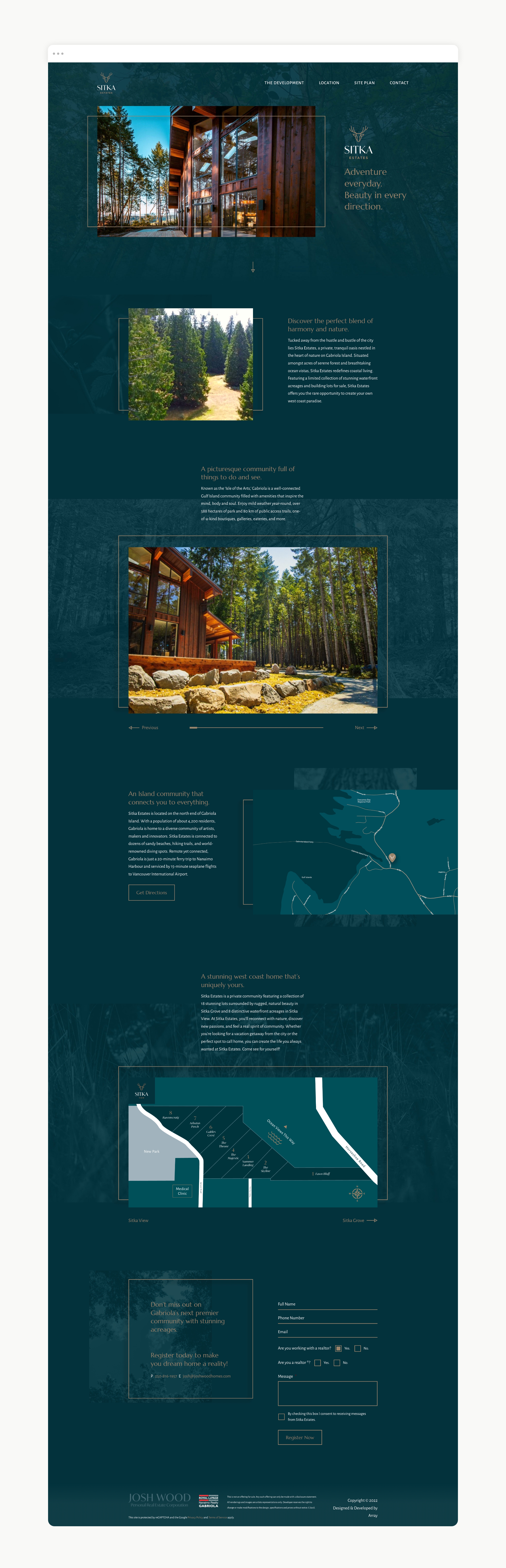
- We custom-designed and developed a one-page web design that features video clips, an interactive image gallery, and a compelling narrative that takes the reader from the building lots through the impressive aspects of the development and into the amenity-rich lifestyle the ‘Isle of the Arts’ offers. A contact form serves as a useful tool that allows customers to inquire further about the development and connects the sales team with prospective leads.
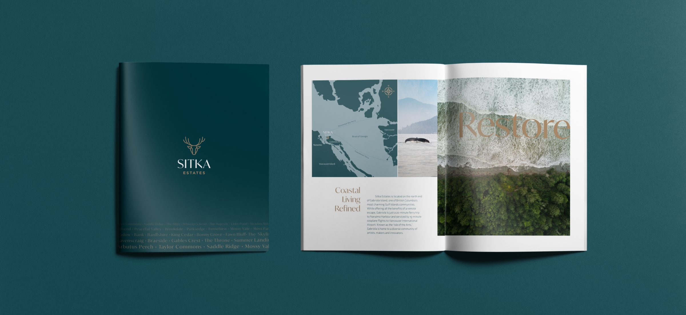
- For the sales brochure, we created a sleek, elegant design that features a blend of earth-tone colours that create a sharp contrast and makes the photography pop. The deep teal elements mirror the lush green spaces and rugged nature that surrounds the development, and the metallic gold accents offer a sense of warmth and natural comfort to the piece.
Great brands don’t stand still. So—what’s next for yours?
We’d love to help you evolve with purpose.