

Location
Selkirk, Manitoba
Hubert Financial, a sister brand to Brio Insurance, helps Canadians grow their savings through competitive high-interest accounts and term deposits. Known for its cheerful personality and straightforward approach, Hubert makes managing savings online feel refreshingly simple.
With Manitoba’s Accessible Information and Communication Standard now in effect, Hubert needed to improve accessibility while moving beyond the limitations of a difficult-to-manage legacy platform. Array rethought the complete digital experience, creating a clearer, more flexible accessible web design that helps rate-savvy visitors compare their options and open an account with confidence.
What did we do?
-
Content Design & Creation
-
Copy Review & Editing
-
Custom Plug-in & Functionality
-
Information Architecture Development
-
Narrative Tone Development
-
Search Engine Optimization
-
UI/UX Design
-
Wordpress & Shopify CMS Development


How Did We Help Them Out?
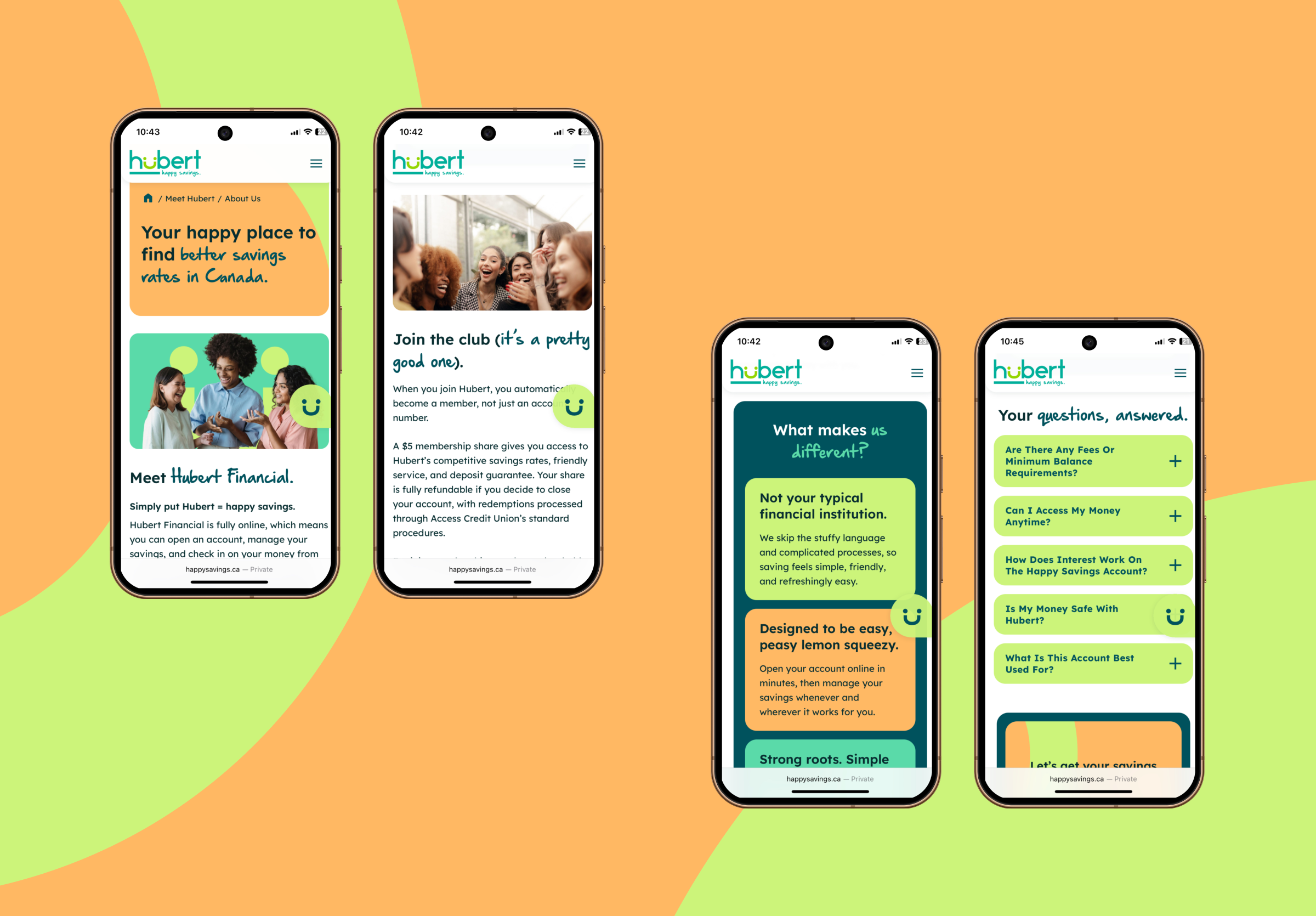
- We began by reviewing Hubert’s existing platform, content and customer journeys to identify accessibility barriers, structural issues and points of friction. Because many visitors arrive after researching rates elsewhere, the experience needed to make comparing products and opening an account simple and efficient.
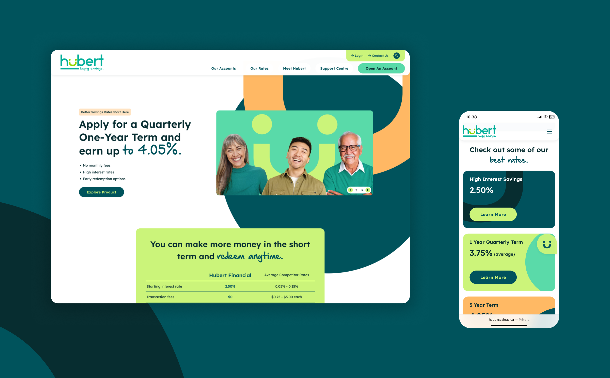
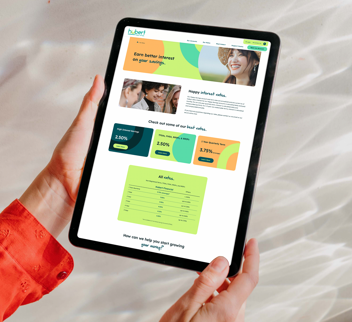
- We rebuilt the website’s information architecture around the questions visitors are most likely to have: what products are available, what rates they can earn and which option best fits their goals. The new structure makes Hubert’s products, rates and support information easier to understand and explore.
- Our copywriting team refined Hubert’s narrative voice to feel warm, helpful and straightforward while maintaining the clarity expected from a financial institution. We removed unnecessary financial jargon and explained account features, term options and deposit protection in plain language.
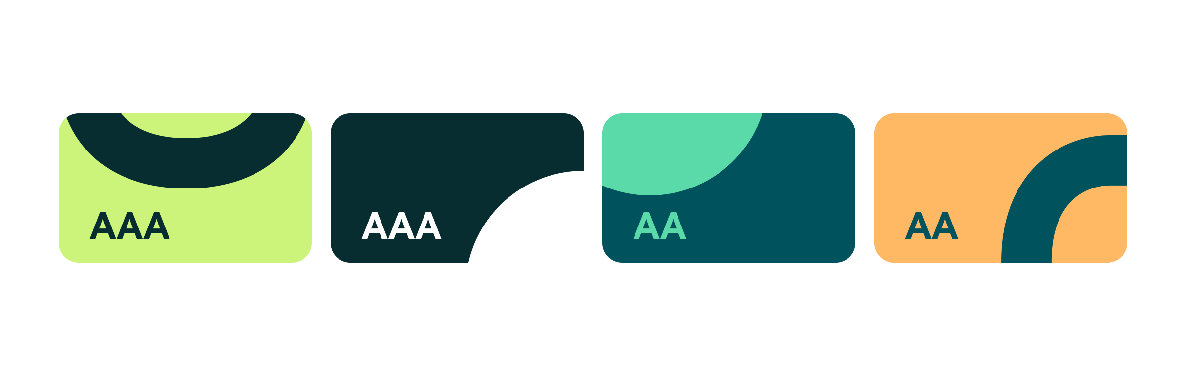
- To preserve Hubert’s recognizable personality while improving accessibility, our design team evolved the existing colour palette with deeper tones that provide stronger contrast alongside its brighter teal, orange and green. Colour combinations were tested against Web Content Accessibility Guidelines, allowing the site to remain colourful while improving readability.
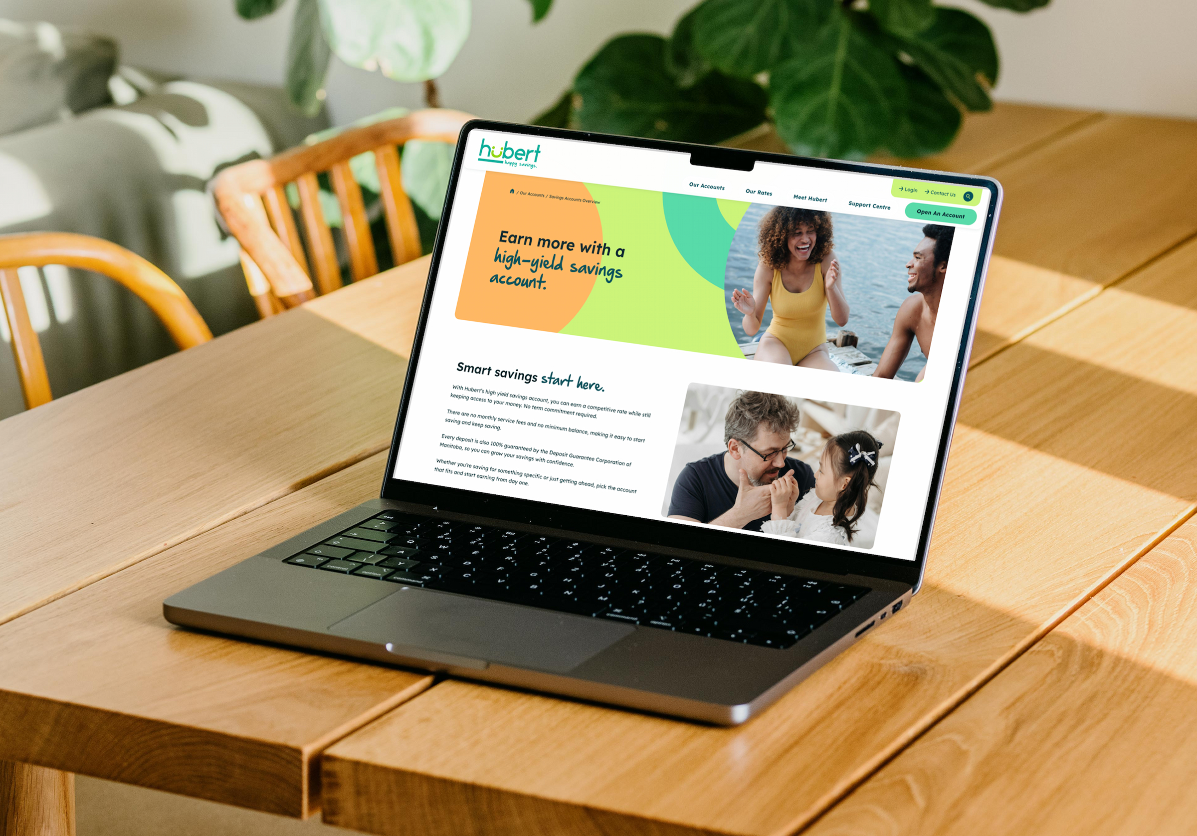
- Typography was also reconsidered with accessibility in mind. Lexend was selected for headings and body copy because of its clear, distinguishable letterforms, while Hubert’s handwritten typeface was reserved for larger accent words. This retained the playful character of the brand without compromising legibility in essential content.
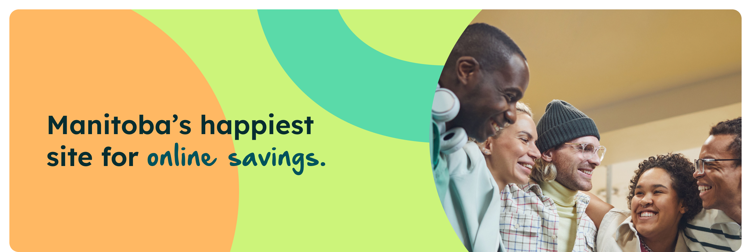
- Our designers expanded Hubert’s existing smile logo into a flexible graphic system of circles, curves, layered cards and cropped shapes. Used throughout the website, these elements create movement and visual interest while giving Hubert a distinct and recognizable digital presence.
- Our development team built a custom WordPress website using a flexible library of Gutenberg content blocks. Cards, accordions, banners, callouts and financial tables allow Hubert’s team to create and rearrange pages while maintaining a consistent design throughout the website.
- Technical accessibility was considered throughout design and development, including keyboard navigation, screen reader considerations, structured heading hierarchies, descriptive alternative text and appropriately sized interactive elements.
- At launch, Hubert’s team received a recorded CMS training to help them manage product information, news and rates independently. The result is a flexible digital platform that makes saving easier to navigate while preserving Hubert’s cheerful personality.
Great brands don’t stand still. So—what’s next for yours?
We’d love to help you evolve with purpose.