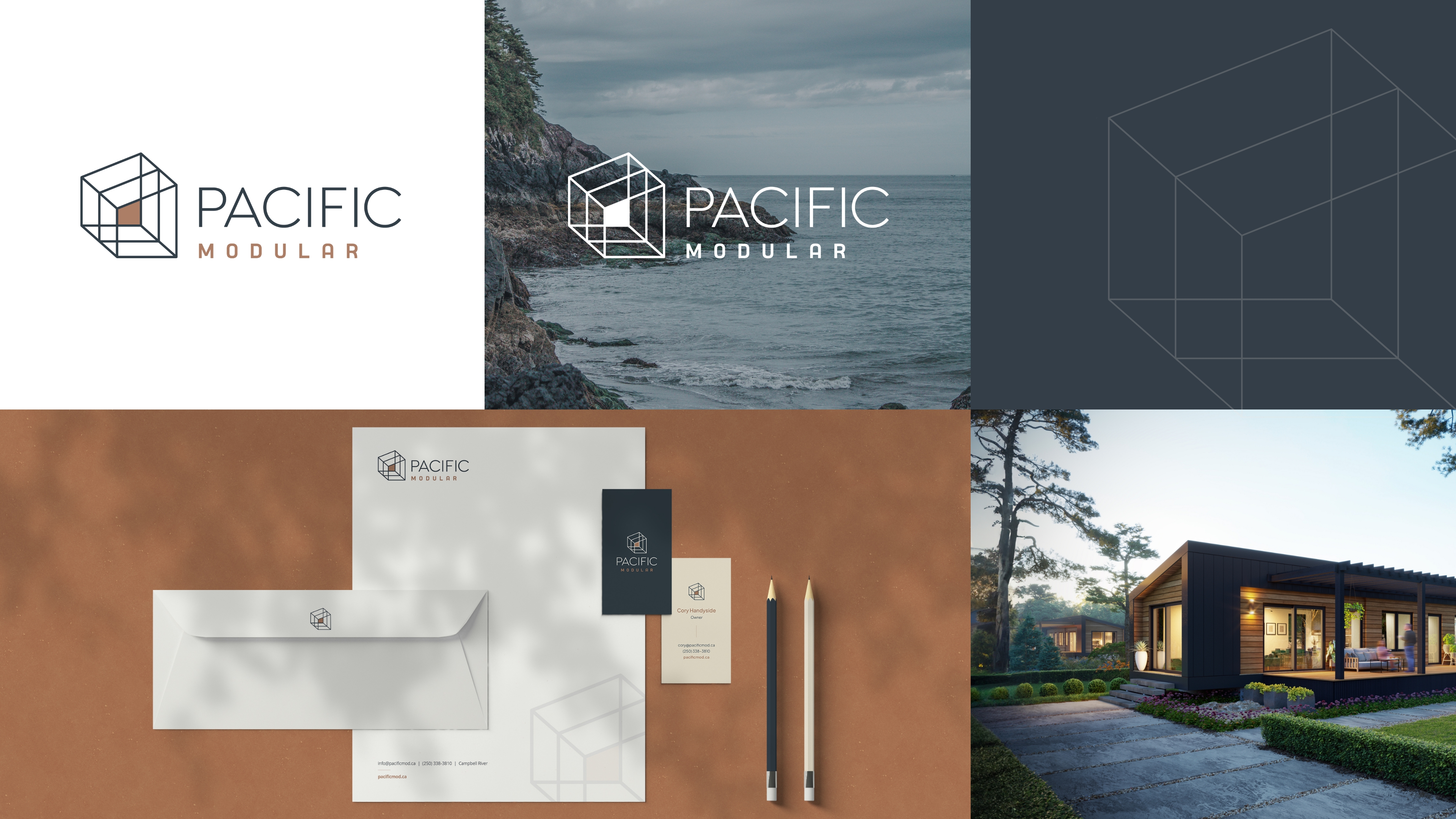
The Power Of Branding: Mind Bending Building Construction Logo For Modular Housing Company

We need to know—is this building construction logo design pointing up or down for you?
Created for Pacific Modular, a new modular housing construction company based in Campbell River, B.C., we recently launched this brand to help build market awareness and drive leads to their website.
Drawing inspiration from the fundamental forms used in their designs, the repeated shapes create a 3D effect that ties back to the quality and efficiency they bring to each build. We paired the icon with a sans-serif font that harmonizes with the logo’s simple line-work. For the word ‘Modular’, we chose a slightly rounded sans serif typeface, giving the overall logo a warm and inviting quality that connects back to home.
The building construction logo serves as the foundational element powering Pacific Modular’s brand. From business collateral to a newly developed website (and truck graphics on the way), we’re proud of how this logo translates across all marketing materials. Fingers crossed we win an award for it too!
