In case you missed our last post, we celebrated our first three award wins of the year for web design and web development. Now we’re back with another four wins, securing our total to 54 awards since our start in 2009. This time we’re celebrating Nanaimo advertising agency’s expertise in logo design, brand development, and graphic design. Check out this year’s winners.
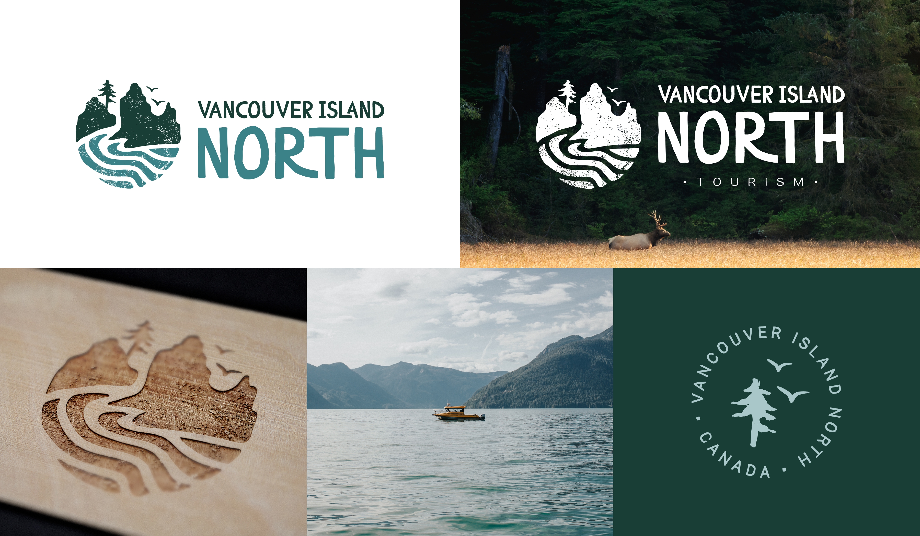
VINT’s brand development double taps award win with gold & platinum.
We took home two awards for
Vancouver Island North Tourism’s (VINT) rebrand—gold at the
2024 MUSE Awards and platinum at the
2024 Hermes Awards. Looking to attract more sustainable travellers to the North Island, our team took a robust approach to VINT’s
brand development including market research, stakeholder surveys, and a new logo design that connects to the region’s wild and coastal nature. This strategic overhaul led to the successful redevelopment of their website and launch of a brand awareness campaign that has positioned the North Island as a must-see destination in 2024.
Pacific Modular wins silver for new logo design.
Tasked with creating a
logo design for a brand new modular housing company,
we snagged silver at the MUSE Creative Awards for
Pacific Modular in the Corporate Identity category. Our team delivered a three-dimensional logo design that not only distinguishes Pacific Modular in a competitive market, but also set the groundwork for a comprehensive
brand development. Our graphic designers developed detailed
brand guidelines to ensure consistency across all mediums. These guidelines cover logo usage, typography, and a color palette that reflects the brand’s core values and aesthetic. With these assets in place, we created a suite of
branded collateral, including
business cards and letterhead, and a custom-developed website to help attract leads.
Shift secures silver for promotional brochure graphic design.
Shift, a leading solar energy company, partnered with our team to develop a print brochure that would support their sales goals and their expansion across Canada. Our
graphic designers and
copywriters created a marketing and promotional brochure that balances informative content with eye-catching visuals. Using holographic foil printing, the cover captures and holds the reader’s attention while the custom fold guides them through a seamless narrative journey. The result? A
silver win at the MUSE Awards for Marketing & Promotional Brochure.
Looking for an award-winning logo design and brand development?
You’re in the right place. Our expertise in logo design, brand development, and graphic design is the reason we remain a go-to partner business marketing in Nanaimo, Victoria, and beyond looking to leave a significant mark in the digital world. Whether you want to refresh your brand or start a new venture, our award-winning team is ready to help you reach your marketing goals. (And maybe win a few awards too.)


