Helping you reach your market in the right places, in the right way. Let’s maximize your brand’s visibility through targeted strategies tailored to your unique goals.
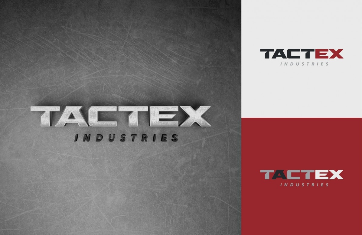
TactEx Industries


We’re glad you found Array and choose to get in touch. So enough about us, what about you?
What can we do for you? Pick one – or any combination – of our awesome services below.
Let us know some of the finer details of your project.
I think we have all we need right now to get the ball rolling here. Just one more thing…